How Should Two APIs be Integrated?
As our apps become more and more integrated with different APIs figuring out how to make them ‘work together’ becomes a larger piece of the software development effort. Protocols and standards have made authentication and sending and receiving messages easier, but don’t help us to understand the contents of the messages. Some companies spend a lot of time designing their APIs and messages, whereas others seem to just surface the details of their underlying system. Even if a company spends a lot of time and effort designing their API the abstractions they come up with will reflect their area of expertise. A land titles system will model an address very differently to an ordering system, even though they are both trying to represent the same physical thing. Neither is wrong, but taking data from one API and transforming it to then send off to another can be complicated. If you’ve ever spoken to stakeholders from different business areas about a ‘customer’ or an ‘order’ only to find out they have different ideas about what these seemingly “obvious” domain entities are you’ll have some idea of the problem. If this kind of mis-understanding can happen inside a single organisation you can imagine how it plays out across different ones.
Another problem is data provenance or lineage. As messages are received, processed and transformed, and then passed on to other systems it also becomes difficult to trace where data comes from. During 2014 I was feeling these problem acutely, working on a large integration project inside a financial institution. In an attempt to solve this problem analysts had crafted large spreadsheets with every field in every message. This was the most rigorous approach to solving this problem that I had seen, but it still left a lot to be desired.
A Solution
In late 2014 over the xmas quiet period one of my friends and colleagues Lee Simpson and I began speculating what an ideal solution to these would look like. Our deus ex machina could be presented with a ‘source’ and ‘target’ message schema, and use some kind of machine learning to identify which fields should be mapped from where on the source message to create a valid target message. Since it is likely the system would not be able to get this perfectly right the system would also need to be able to be modified by a human analyst, which would provide further training data for the system. We also thought it would be cool if you could view diagrams of the mappings. The system should also be centralized - we’d seen enough problems where problems had arisen because someone was not working from the latest version of a mapping spreadsheet that an analyst was working on.
api-map.com
Over the next few years in my “spare time” I built out these ideas, and some time in 2015 or 2016 I released it as api-map.com. The machine learning side of things is still in its infancy, but the system works reasonably well by using a number of different heuristics like the similarity of two element’s names, whether they are the same type, the similarity of the name of their parent in the message, whether any of their parents or siblings have already been mapped etc. Each heuristic is weighted to give a score, and the most likely matches are presented to the user to choose which ones should be mapped. The user can specify when the mapping should take place, and any transformations that should occur.
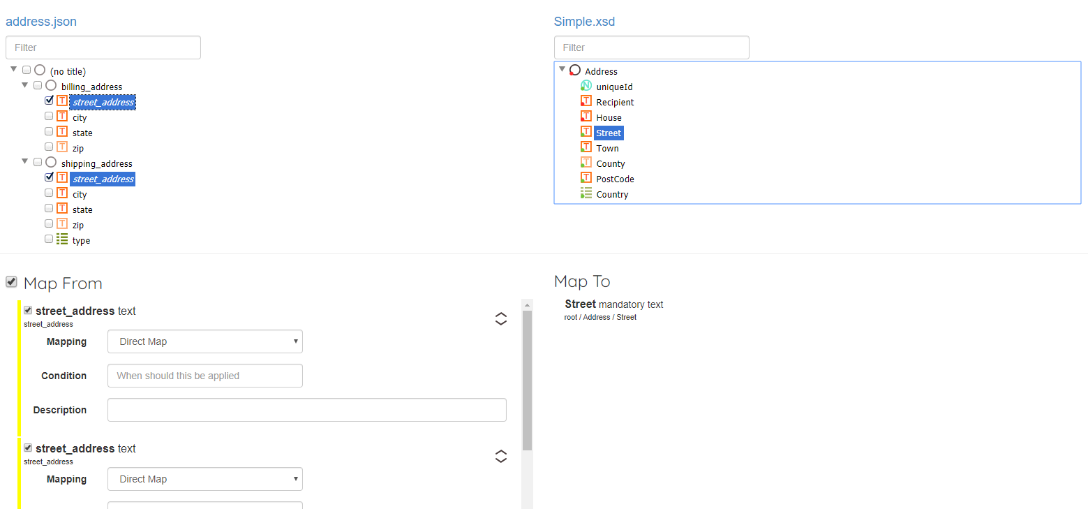
Although the system does still have a feature to ‘auto-map everything it can’ the default mode is for a human user to explicitly choose which fields should be mapped, with assistance from the ‘machine’ (especially when building a financial system). Fortunately I was able to get lots of good feedback from my integration analyst colleagues along the way - a big thanks to Dean, Joern, Susie and many other folks from Mexia who helped me shape these ideas. I hadn’t touched api-map for a while but recently decided to port it from .net 4.5 and SQL Server to .net core 3.1 and Postgres, and was reminded of the fact that I had never actually written about it here on my blog.
One of my favorite features is the ability to add what I can ui annotations - you upload an image and add a rectangle to it, and associate it with a particular field. You can specify the name of the field (which can be used in matching heuristics) but it also shows the UI fields on the diagram as you can see in the screen-shot below. I think this can really help non-technical people visualize the mapping concepts better - data that you can see here will be transformed like this and later on show up here.
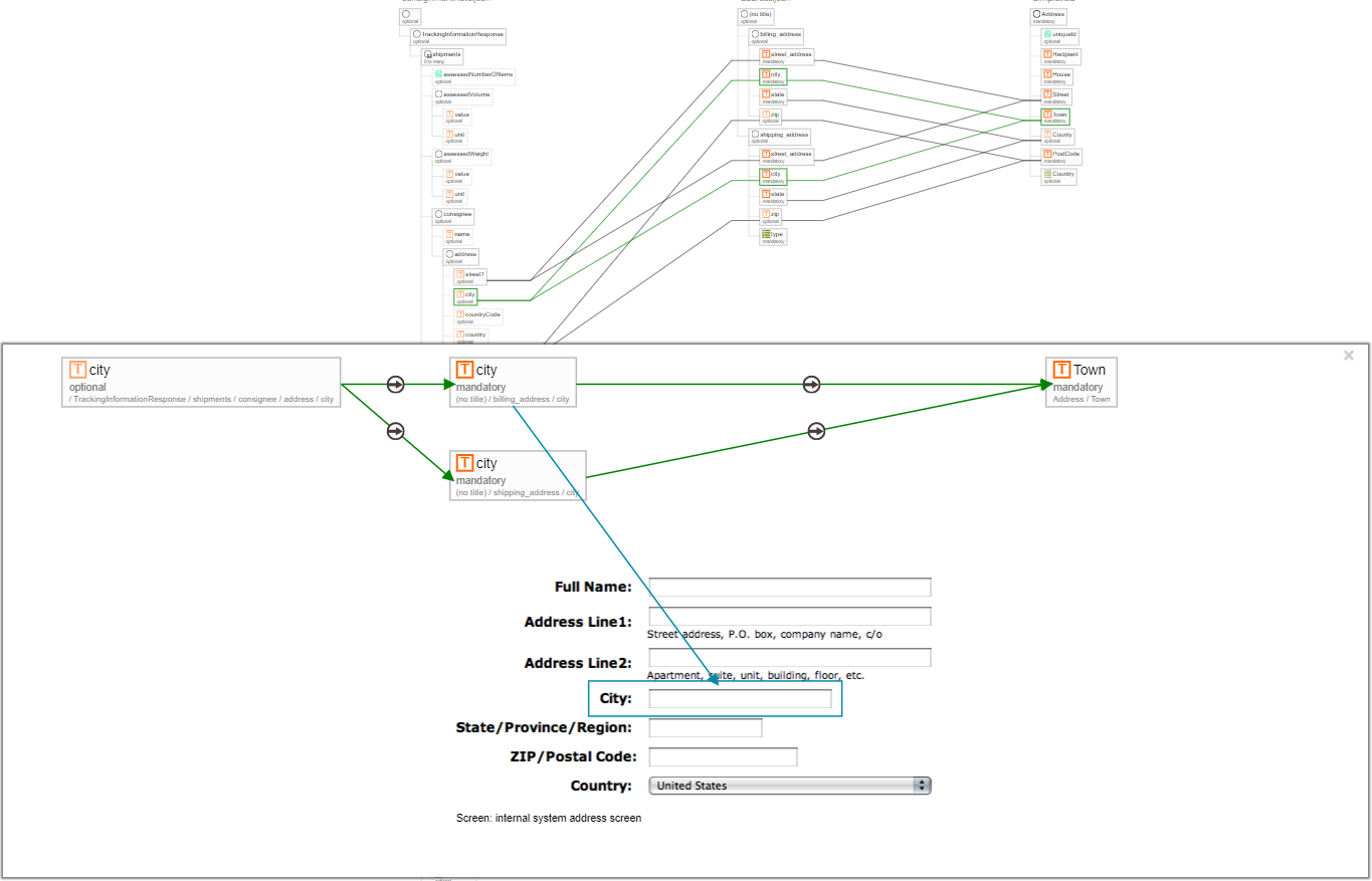
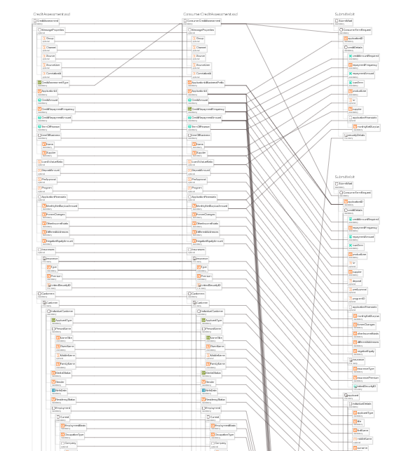
It can also produce some interesting diagrams to visualize the complexity across multiple mappings (don’t worry - they’re zoom-able).
If any of this sounds helpful to you please give api-map a try (or if you’re a dev working with analysts you can suggest it to them). There is a ‘getting started’ video on the home-page which you can also see below.
Header photo by Alexandre Debiève on Unsplash