Sometimes I come across a piece of user-interface that brings a smile to my otherwise perpetually scowling face. Usually it is a fairly mis-shapen dialog or utility application. I smile because I can almost picture in my minds eye how this dialog was created. A developer needed a screen for something, one or two text boxes and not much more, so they created “the dialog”, maybe just to “try something out“ and always with the intention of removing it before the product ships. They discovered they needed a few more parameters, so a couple more controls were added in a fairly hap-hazard fassion. “The dialog” exposes “the feature“, something cool or quite useful. Admittedly “the feature” is more tailored towards power users, but it’s still pretty cool. The developer thinks of new parameters that would make “the feature” even more powerful and so adds them to the dialog. Maybe a few other developers or power users see “the dialog” and also like “the feature”. But why doesn’t it expose THIS parameter? New controls are added. Pretty soon the technical team are so used to seeing “the dialog” the way it is that they become blind to its strange appearance. Ship time approaches and the product goes through more thorough testing, and “the dialog” is discovered, but it is too late to be heavily re-worked. Instead it is given a cursory spruce-up.
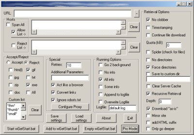
I’ve lost count of the number of times I’ve seen “the dialog“ in different guises (and I’ve probably implemented a few of my own too). Here are two candidates that were close to hand. I think the worst offender I ever saw was a WMI utility from microsoft - it was like a whole application of “the dialog”s thrown together. 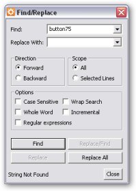
Here’s my quick checklist of things to look for if you’re trying to avoid create “the dialog“ yourself.
- Strange aspect ratio/portrait aspect ratio (I think portrait just looks odd for dialogs, except maybe property-page style ones)
- Lots of controls (because you’ve allowed too many options)
- controls of same type with differing sizes near eachother
- Non-standard behavior for controls (checkboxes that function as hyperlinks etc)
- non-standard placement of controls
- looks different to every other screen in your application
- options don’t seem very cohesive
- lots of explanation required for options
- you wish you’d just used a property grid, or think you might need to add just one more tab
Comments
Thanks for this funny observation about the dialog! I’ve seen many of these and what’s worse — I’ve seen non-tech users struggling with them.
I think that often the problem goes even deeper than poor UI design. Many times I wonder who even needs the freaking zillion options in the first place. But maybe that’s just me.
To prove your point — see the discussion at http://www.codinghorror.com/blog/archives/000734.html
And btw — too bad that Jeff ripped your whole post and stole your thunder :-)
http://www.wc3campaigns.net/showthread.php?t=79326
It is a project in which I, a developer made the interface for. So don’t think the second dialog is an exaggeration.
How to detect bad UI design [closed] | CL-UAT
How to detect bad UI design [closed] - DL-UAT
You could add "inconsistent capitalization" to that list. The bottom-right of the second picture uses 3 styles all in the one GroupBox.
You could also add "you label checkboxes with things like ‘Only go deeper’".